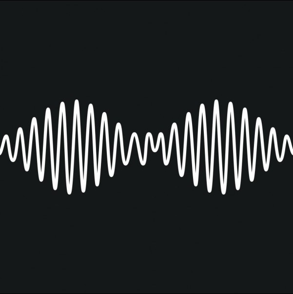
The simplicity of the album cover is a caused by the bold black and white, the boldness has allowed the logo to become a recognisable symbol of this band. The graphics are meant to represent sound waves however some may have an alternative opinion and say that this represents the shape of a woman's bra. This connects with graphics in their music video for 'Do I Wanna Know?' where woman are highly sexualised. The graphics could link with the idea of 'Drugs, Sex Rock&Roll" a quote that has travelled through the rock industry for many years, Arctic monkeys may want to be promoting this idea to echo to the audience their genre of music. Black and White is colour often used within the Rock genre as is connotes with edgy styles and is simplistic as it is supposed to be focused upon the music instead of gimmicks.

The line continues through to the back of the album showing continuity. The band have coined their own recognisable font which they have used with previous albums making all of their albums unique to them and original. I would like to have our own font for our digipak because it would make our work immediately recognisable and ore popular as it will be vastly well known.


The 'XX' CD features a symbolic and simple graphic design of an X. this makes the audience immediately aware as to who the artist is due to their coined logo.
The artwork of the band is simplistic yet gives a futuristic feel therefore i believe the audience are quite modern. The futuristic elements are drawn from the pure white and the pattern inserted in the X. A lot of minimalistic artwork has become contemporary and this band exhibits this.
The XX CD Poster


It may be perceived by some that the artist is being portrayed in a seductive manner due to that fact that on the album cases she is the main focus. Her posture and facial expressions connotes with this portrayal too. The pictures vary between black and white and highly saturated photos (that give off the impression they were taken with a Polaroid camera), this gives an indication that the audience of this album are quite indie and alternative due to the fact Polaroid pictures are rather popular within indie audiences. This is a good way of creating a subliminal tone that the album is within the alternative genre. The seductive poses embodies qualities of femininity which interests women as well as men being attracted to her.

Lana Del Rey Album Poster
The same applies for the poster. The picture is highly saturated and the artist is posing in a seductive manner. The over the shoulder pose ignites a sense of mystery and intrigue within the audience as her hair conceals much of her face. A colour within this picture that is used widely is red. Red connotes with different emotions such as love and anger, this can evoke feelings from the audience about what kind of music will be within the album.
The typography at the top of the poster continues the sentence to the bottom this creates a path for the eye. The album is called ultraviolence which is a lyric to one of her songs. It can be defined as 'horrible violence,' linking the hateful emotion shown through the red. The word ultraviolence on its own captures the audience interest by creating a bold statement.
I really like the simple font on the poster because it is bold and eye-catching, making the statement memorable, however i feel as though we wouldn't be able to use this for our 1940's video as it would apply more to the 70's based on the highly saturated effect.
No comments:
Post a Comment